Content
The content area is used for displaying most of the content of the site.
Table of Contents
Anatomy
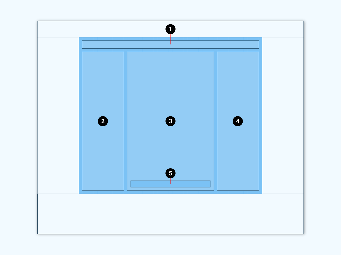
- Breadcrumbs
- Sidebar (left)
- Primary content area
- Sidebar (right)
- Pagination
The breadcrumb navigation indicates the user’s position on the website.
The primary content area displays all the main content of the page.
The right sidebar or secondary content area is used to display additional content to the primary content.
Enable or disable the right sidebar in the corresponding template settings.
The left sidebar is commonly used to show filter options for primary content listing. Like reducing the listed products to those with a specific color, size and so on. So the left sidebar in Material WordPress is only available for products listings. To do so assign widgets to widget area Shop Sidebar.
Variants
Depending on the use case and template settings the content area can be build with no sidebar or only a left or right sidebar.

Left sidebar 
No sidebar 
Right sidebar
Even if those examples above stylize the top app bar, drawer navigation and the footer, all those elements are optional and will disappear if not used. All sidebars and the breadcrumbs can be deactivated too and only the main content area will be left over.
Responsive behaviour
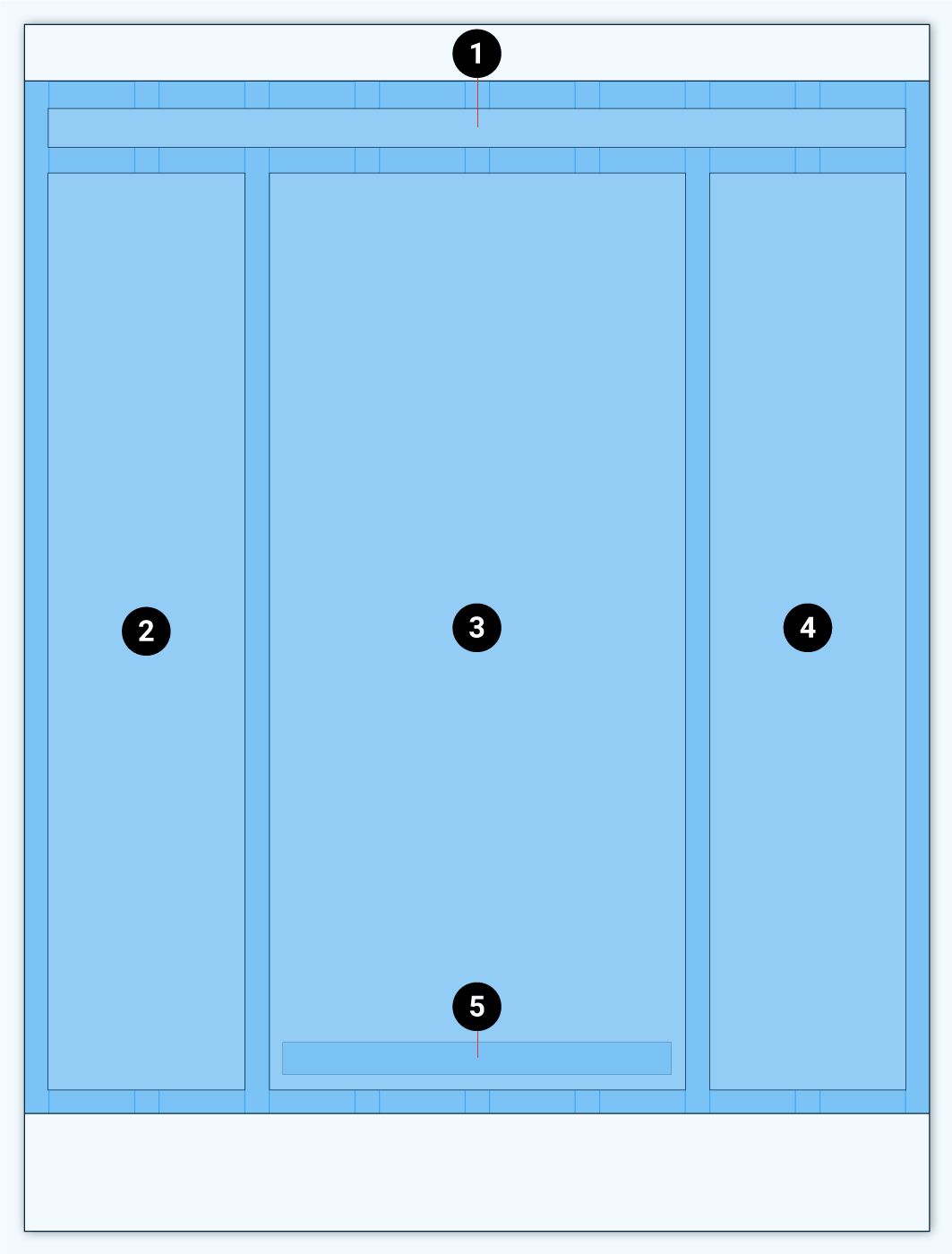
By default the content area shows the main content and its sidebars next to each other for desktop view. There are 12 columns available. Each of the the sidebars span over 3 columns and the main content area takes up the rest of the available columns.
For tablet view the amount of columns is reduced to 8. And the sidebars span over 2 columns.
For mobile devices only 4 columns are available and each sidebar spans over 4 columns. Thus the sidebars will show above and below the main content area.

Tablet 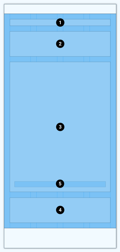
Mobile

The change between mobile, tablet and desktop depends on breakpoints which target the screen width of each device.
The amount of columns each elements uses can be defined in the settings of the templates.
Costomizing
The content area can be customized within the WordPress customizer (WordPress Admin >> Appearance >> Customize >> Theme Settings >> Content).
Content width
Set the maximum width for the content container. For screen sizes below this width the content will behave fluid / responsive.
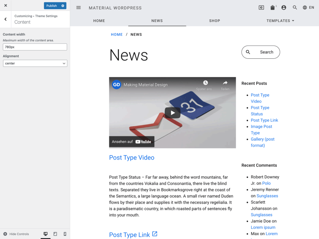
Content width: 780 pixels 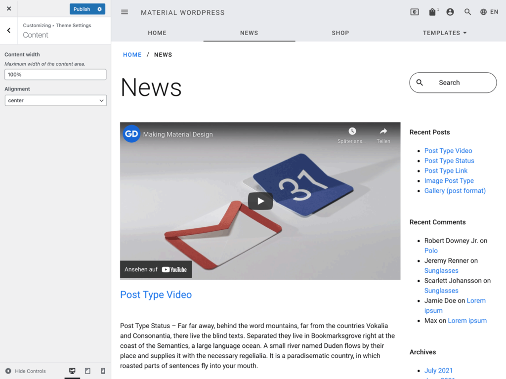
Content width: 100%
Alignment

left aligned 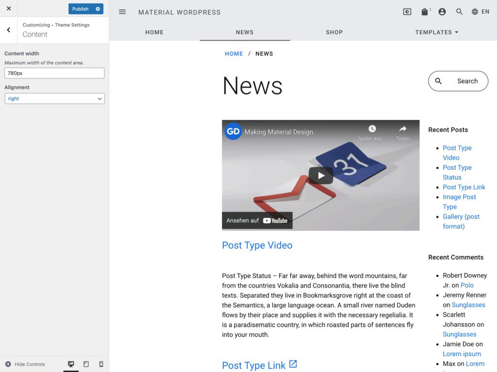
right aligned