Navigation Drawer
The Material WordPress theme drawer displays the name or logo of the website, its logo, contains three different positions for navigation menus and three different widget areas.
Table of Contents
Anatomy
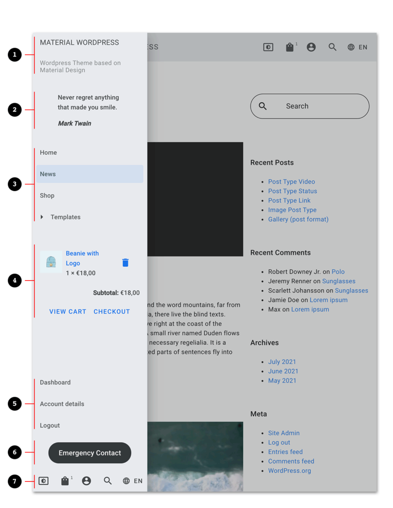
- Header (Website name or logo and description)
- Widget Area – Position Drawer Top
- Navigation Menu – Position Drawer Menu
- Widget Area – Position Drawer Middle
- Navigation Menu – Position Drawer Bottom Menu
- Widget Area – Position Drawer Bottom
- Navigation Menu – Position Drawer Action Menu
Customization
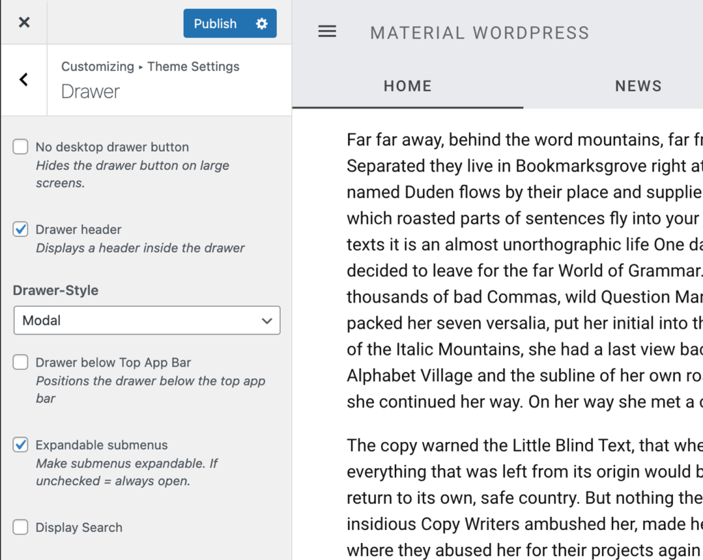
The drawer can be customized within the WordPress customizer (WordPress Admin >> Appearance >> Customize >> “Theme Settings >> Drawer”).
No desktop drawer button
Hides the hamburger button which opens the navigation drawer on larger screens.
Top App Bar with hamburger button 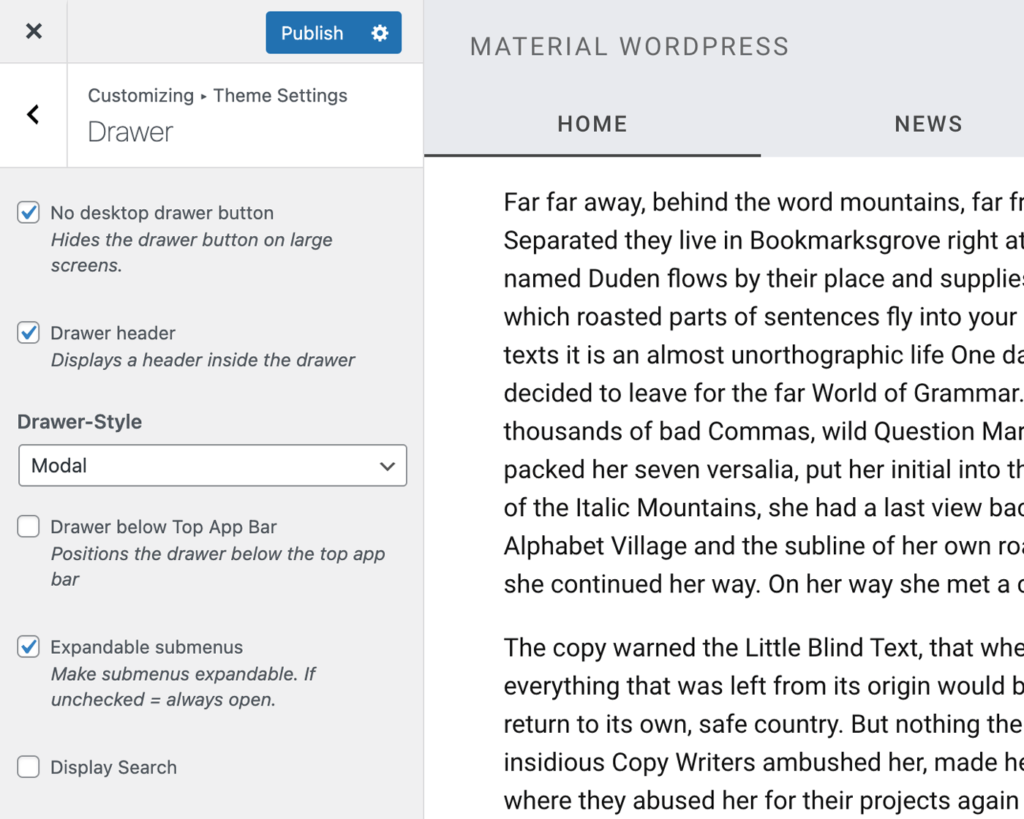
Top App Bar without hamburger button
Show or hide the drawer header
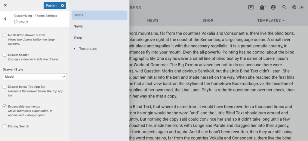
Variations
The default drawer style is “modal” which swipes the navigation above the content area.
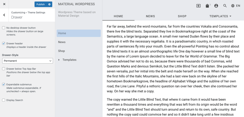
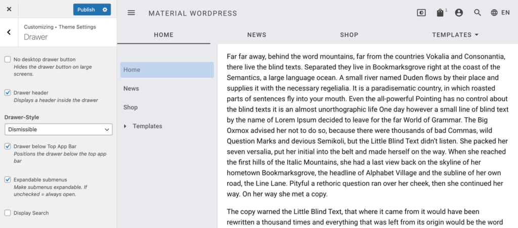
Other available variations are “dismissible”, “permanent” and “permanent (large screen), dismissible (small screen)”. In contrast to the modal drawer all those styles show the navigation drawer next to the content area and thus reduce its available space.
While the dismissible drawer can be opened or closed by the user, the permanent drawer is always visible. The mix between dismissible and permanent makes it possible to always show the drawer on large screens and enables the website visitor to show/hide it on smaller screens.
Show drawer below Top App Bar
Expandable Submenus
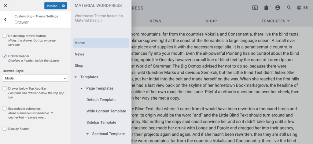
By default submenus within a drawer menu are collapsed. By clicking on the small arrow or the parent menu name then the submenu will expand. By disabling this feature all menu items will be always visible.

